Plot Gallery
Every plotting helper in landau.plot at default settings, applied to one
shared model system so the figures can be compared directly.
The system is three ideal solutions — fcc, hcp, liquid — ordered by the
temperature at which each becomes stable (fcc lowest, liquid highest). The
endpoint energies and entropies are loosely taken from the visual-review
testplots (tests/integration/testplots.py). The numbers carry no physical
meaning; they are chosen to produce a diagram in which all three phases appear.
Setup
import numpy as np
import pandas as pd
import matplotlib.pyplot as plt

import landau.phases as ldp
import landau.calculate as ldc
import landau.plot as lpl
Each phase is an IdealSolution between an A endpoint (concentration 0) and a
B endpoint (concentration 1). Higher entropy lowers the free energy faster with
temperature, so the high-entropy liquid wins at high T while the low-entropy
fcc wins at low T.
fcc = ldp.IdealSolution(
    "fcc",
    ldp.LinePhase("fccA", fixed_concentration=0, line_energy=-3.00, line_entropy=1.0 * ldp.kB),
    ldp.LinePhase("fccB", fixed_concentration=1, line_energy=-2.00, line_entropy=1.1 * ldp.kB),
)
hcp = ldp.IdealSolution(
    "hcp",
    ldp.LinePhase("hcpA", fixed_concentration=0, line_energy=-2.975, line_entropy=1.8 * ldp.kB),
    ldp.LinePhase("hcpB", fixed_concentration=1, line_energy=-1.95, line_entropy=1.1 * ldp.kB),
)
liquid = ldp.IdealSolution(
    "liquid",
    ldp.LinePhase("liquidA", fixed_concentration=0, line_energy=-2.75, line_entropy=5.0 * ldp.kB),
    ldp.LinePhase("liquidB", fixed_concentration=1, line_energy=-1.75, line_entropy=4.4 * ldp.kB),
)
phases = [fcc, hcp, liquid]
Overview
Every two-axis plotting helper at its default settings. The four panels share
the same phases: a temperature cut at fixed chemical potential, a chemical
potential cut at fixed temperature, and the two two-dimensional diagrams in
concentration–temperature and chemical-potential–temperature space.
df_T = ldc.calc_phase_diagram(phases, np.linspace(100, 1000, 40), mu=0.0, keep_unstable=True)
df_mu = ldc.calc_phase_diagram(phases, Ts=800.0, mu=100, keep_unstable=True)
df_cT = ldc.calc_phase_diagram(phases, np.linspace(200, 1000, 50), mu=100)
df_muT = ldc.calc_phase_diagram(phases, np.linspace(200, 1000, 80), mu=np.linspace(0.5, 1.5, 80))

fig, axes = plt.subplots(2, 2, figsize=(12, 9))
lpl.plot_1d_T_phase_diagram(df_T, ax=axes[0, 0], show=False)
axes[0, 0].set_title("plot_1d_T_phase_diagram")
lpl.plot_1d_mu_phase_diagram(df_mu, ax=axes[0, 1], show=False)
axes[0, 1].set_title("plot_1d_mu_phase_diagram")
lpl.plot_phase_diagram(df_cT, ax=axes[1, 0], tielines=True)
axes[1, 0].set_title("plot_phase_diagram")
lpl.plot_mu_phase_diagram(df_muT, ax=axes[1, 1])
axes[1, 1].set_title("plot_mu_phase_diagram")
fig.tight_layout()
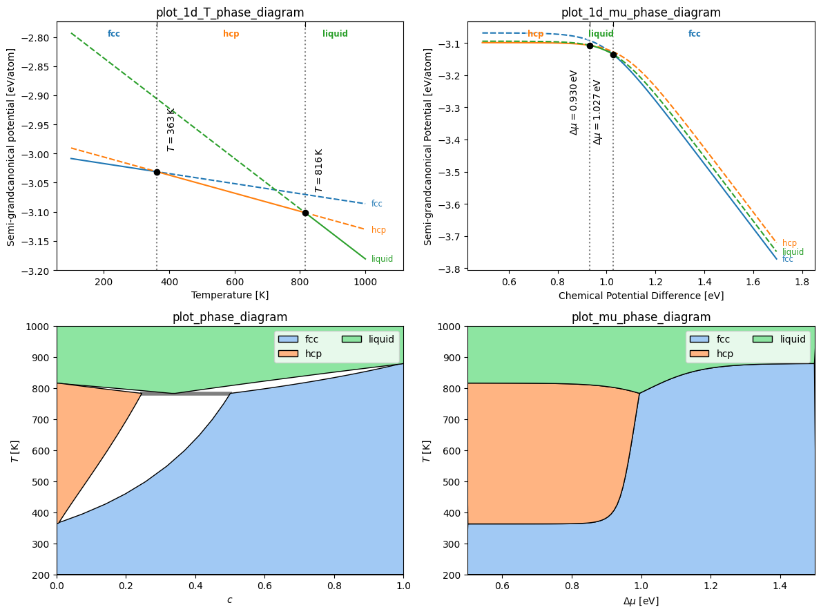
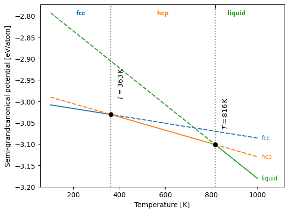
1D temperature scan
plot_1d_T_phase_diagram draws the semi-grand potential of every phase along a
temperature cut at fixed chemical potential difference. The stable phase is
solid, metastable branches are dashed; transitions are ticked on the top spine
and each branch is labelled at its right end. Pass keep_unstable=True to
calc_phase_diagram to retain the metastable branches.
df_T = ldc.calc_phase_diagram(phases, np.linspace(100, 1000, 40), mu=0.0, keep_unstable=True)
lpl.plot_1d_T_phase_diagram(df_T)
<Axes: xlabel='Temperature [K]', ylabel='Semi-grandcanonical potential [eV/atom]'>
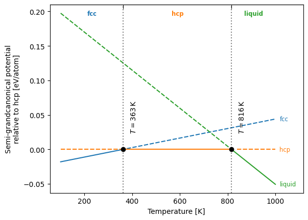
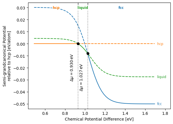
reference_phase subtracts that phase’s potential along the cut, which spreads
out the small differences near the transitions.
lpl.plot_1d_T_phase_diagram(df_T, reference_phase="hcp")
<Axes: xlabel='Temperature [K]', ylabel='Semi-grandcanonical potential\nrelative to hcp [eV/atom]'>
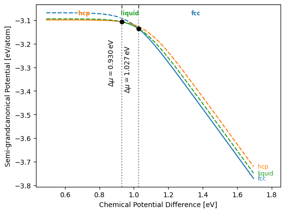
1D chemical-potential scan
plot_1d_mu_phase_diagram is the isothermal analogue: the semi-grand potential
along a chemical-potential cut at fixed temperature. Here T = 800 K, where all
three phases are stable over part of the range.
df_mu = ldc.calc_phase_diagram(phases, Ts=800.0, mu=100, keep_unstable=True)
lpl.plot_1d_mu_phase_diagram(df_mu)
<Axes: xlabel='Chemical Potential Difference [eV]', ylabel='Semi-grandcanonical Potential [eV/atom]'>
lpl.plot_1d_mu_phase_diagram(df_mu, reference_phase="hcp")
<Axes: xlabel='Chemical Potential Difference [eV]', ylabel='Semi-grandcanonical Potential\nrelative to hcp [eV/atom]'>
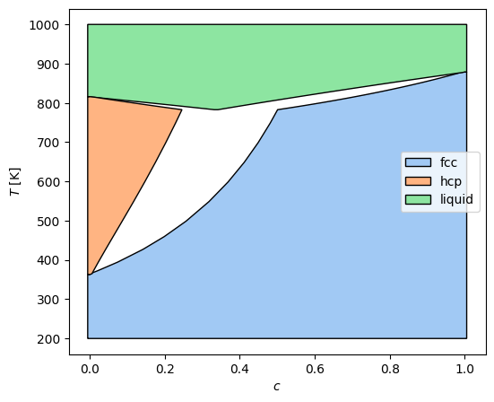
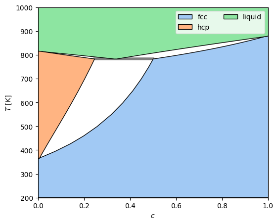
2D concentration–temperature diagram
plot_phase_diagram fills each stable phase region as a polygon in
concentration–temperature space. tielines=True overlays the two-phase
coexistence tielines. poly_method selects the polygon-construction strategy;
the default depends on which optional extras are installed.
df_cT = ldc.calc_phase_diagram(phases, np.linspace(200, 1000, 50), mu=100)
fig, ax = plt.subplots(figsize=(6, 5))
lpl.plot_phase_diagram(df_cT, ax=ax, tielines=True)
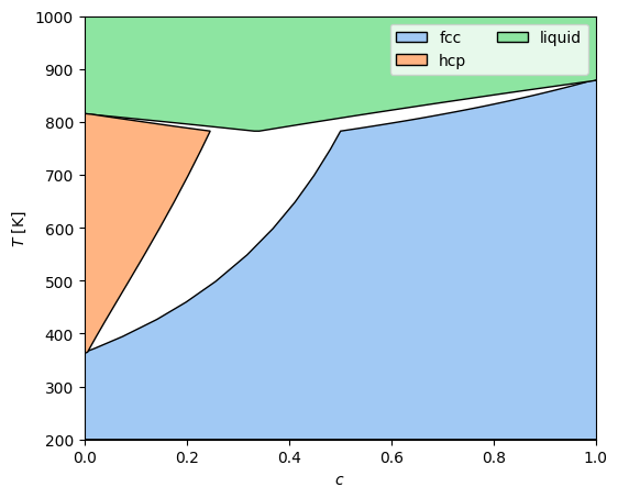
Same diagram without tielines.
fig, ax = plt.subplots(figsize=(6, 5))
lpl.plot_phase_diagram(df_cT, ax=ax, tielines=False)
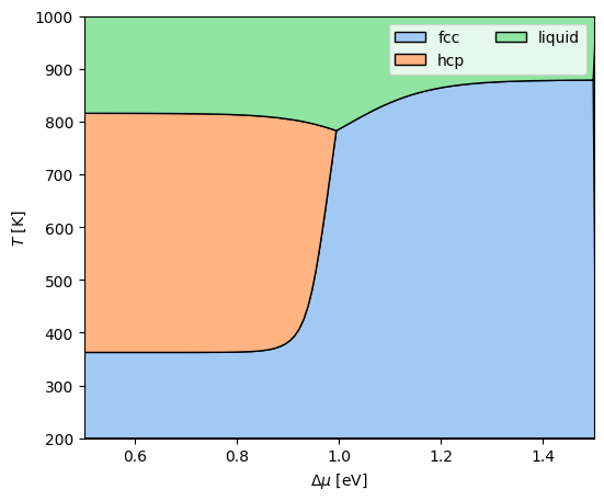
2D chemical-potential–temperature diagram
plot_mu_phase_diagram plots the same equilibria in chemical-potential–
temperature space, where the two-phase regions collapse to lines. Sample both
axes so the refiner has a 2D grid to work with.
df_muT = ldc.calc_phase_diagram(phases, np.linspace(200, 1000, 80), mu=np.linspace(0.5, 1.5, 80))
fig, ax = plt.subplots(figsize=(6, 5))
lpl.plot_mu_phase_diagram(df_muT, ax=ax)
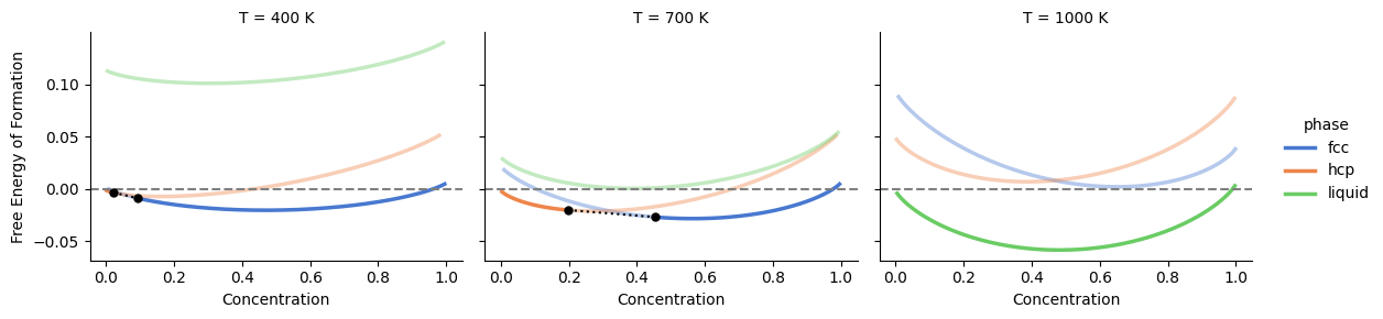
Excess free energy
plot_excess_free_energy draws the excess free energy versus concentration,
one facet per temperature, from a keep_unstable=True frame concatenated over
several temperatures. With convex_hull=True the stable phases are solid, the
metastable parts faded, and the common-tangent segments overlaid in black.
df_excess = pd.concat(
    [ldc.calc_phase_diagram(phases, Ts=T, mu=200, keep_unstable=True) for T in [400, 700, 1000]],
    ignore_index=True,
)
lpl.plot_excess_free_energy(df_excess, convex_hull=True)
<seaborn.axisgrid.FacetGrid at 0x7f266c323c90>
Building polygons by hand
plot_phase_diagram is a thin wrapper over get_polygons + plot_polygons.
Calling them directly gives control over the colour map (via
get_phase_colors) and the axes, which is useful when overlaying a phase
diagram on other artists.
polys = lpl.get_polygons(df_cT)
colors = lpl.get_phase_colors(df_cT["phase"].unique())

fig, ax = plt.subplots(figsize=(6, 5))
lpl.plot_polygons(polys, colors, ax=ax)
ax.autoscale()
ax.set_xlabel("$c$")
ax.set_ylabel("$T$ [K]")
ax.legend()
<matplotlib.legend.Legend at 0x7f266c403ed0>